For the first time in ten years, a new brand identity has been unveiled for SNCF (an acronym for Société nationale des chemins de fer français, France’s state-owned railway company).
 The advertising agency with which the railway company has been working for four years, Landor & Fitch, has created the brand that celebrates “sustainable mobility” and “the paramount importance of rail transport in tomorrow’s society”.
The first stage of this collaboration between the advertising agency and SNCF was to define a new brand architecture that clarifies the group’s structure and repositions SNCF at the heart of its ecosystem “as a catalyst for all its expertise, sustainable mobility, growth on the ground and social commitment”.
A new brand identity for SNCF, with a strong slogan
 To carry out this work, the agency launched a survey on a sample of 994 French people, representative of the population, to assess the strength of the SNCF brand codes and understand which are most recognised and appreciated. As such, the log and its shape were highlighted, with an immediate and instinctive brand association by 56% of French people. The shape of the logo thus became the starting point in the approach to creating the new “colourful, flexible, playful and dynamic” identity
The new brand architecture has redesigned the SNCF brand ecosystem and now allows each company within the group to start with a dedicated and differentiated visual identity. The different SNCF companies thus have their own brand universes.
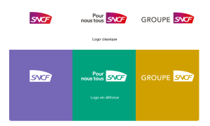
“To affirm our commitment to all French people, we have chosen a strong slogan, <For all of us> (Pour nous tous in the original). We have created a signature logo, which is mainly used in colour on a white background,” says the SNCF group.
The internal launch, within the rail group, took place in March this year, and is being implemented bit by bit.
Share on:


